SPL Design Process
Research
We went to the SPL Central Branch to observe the physical space as well as how patrons interact within the library.
Key Insights
1. Library catalog does not show detailed information about the location and availability of books.
2. Some visitors come to the library to explore and some visitors come to the library knowing exactly what they are looking for.
Observation Analysis


Images of my team during observations.
We interviewed librarians and library associates about visitors’ experiences in the library as well as how users utilize their online website for the different resources provided by SPL.
“People come to me, point to their phone and ask ‘where is this book’” - Librarian
Key Insights
1. The library offers many resources, like events for all ages, that visitors are unaware of.
2. Shelf Map feature on the SPL website is hidden.
Semi-Structured Interviews


Screenshots of old SPL mobile UI with library resources.
We looked at the current SPL mobile website and highlighted some key insights based on Neilson Norman’s 10 usability heuristics for UI design.
Key Insights
1. Aesthetic & Minimalistic: Outdated interface and lack of clear informational hierarchy.
2. Visibility of System Status: Library features are difficult to find.
Heuristic Analysis: Neilson Norman Heuristics

Screenshots of old UI design.
We created a Site Map with all the pages of the library website to look at the current system structure.
Key Insights
1. The website is overwhelming with a lot of information and hidden features.
2. There are not a lot of filtering options for customization.
SPL Site Map

Current SPL Site Map
We looked at three other library mobile apps and noted the strength and weaknesses.
Key Insights
1. Most apps includes physical map of library locations and has the ability to add calendar events to phone.
2. There is a lack of visual hierarchy as well as limited use and access of information.
Competitive Analysis

Based on our research we realized that the current SPL website has an overwhelming amount of information that feature all the great resources the library offers. With that in mind, we came up with the following question:
How Might We
“How might we design a platform that allows visitors to quickly and easily find desirable resources?”
Define
Explorative User
Comes to library to browse different books
and events.
User Profile


Decisive User
Comes to the library with something specific
in mind.
Accessible
Bringing forward the most important features so they are easy to access regardless of ability.
Simple
All information and resources is organized and easy to navigate.
Frictionless
Users are able to find what they are looking for inside and outside the library.
Design Principles
Ideate
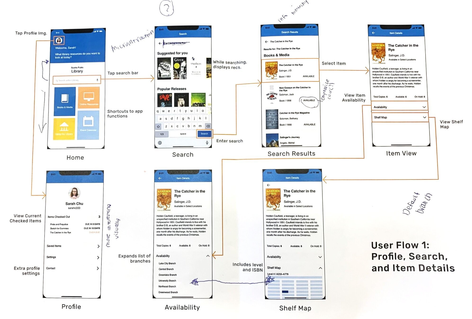
Keeping in mind our design principles and all the insights we found, we began sketching our ideas of what our new redesign user-flow would be like and the functionalities it will hold.
Sketches/
Wireframes/
Task Flows


Prototype
Iterations

Books and Media Page
This page is one of the main pages for both Explorer and Decisive users. Throughout the iteration process we worked on having a clear hierarchy and more simple ways to navigate the page.


Iteration 1
Iteration 2
Iteration 3


Iteration 1
Iteration 2
Iteration 3
Event Filtering Feature
We explored two different kinds of filtering features and found that having a filter icon that opens a new filtering page is the most intuitive.


Iteration 1
Iteration 2
Iteration 3
Shelf Map Feature
Our first and second iterations included the shelf map provided by SPL. After user testing we worked towards creating a simpler shelf map that is easier to read.
UI Style Guide

We went through three different UI iterations during the iteration process. We worked on simplifying the layout, colors, and interaction patterns to create a cleaner and more simple design.
After the iteration phase, we finalized our design and created a final UI design style guide. It was used by all team members throughout the creation of the final prototype to help us create a cohesive look throughout the entire app.
Testing
Usability Testing
We tested each of our design iterations with 10 potential users and gathered feedback that helped us make better design decisions between iterations that best suite our users needs.
Key insights
Overall navigation is more clear than previous SPL website
Some buttons did not look clickable
Having history appear when pressing the “search” button is helpful for navigation
The shelf map was hard to read
Overall design was flat and did not look finished
“Interaction seems familiar to stuff I have done before” - Participant 7

Final Design
Reflection
I very much enjoyed working with my team. We collaborated on all parts of the project from user research to prototyping. Once we entered the iteration phase and divided the pages along the three of us, we experienced some challenges in unifying the app design. Over time, we learned that using symbols in Sketch is the most efficient way for us to collaborate and to make sure our screens have a cohesive look and feel.
During the iteration phase, my role was to create the event browsing pages and filtering system. I was also involved in critiques for the other screens as well. It was important for me to look back at our research and user profiles to make sure the event browsing experience is intuitive and answers to our design principles. I added a filtering system that helps explorative users get event suggestions based on their interests and needs. In addition, I created Interested and Going buttons for a smoother RSVP experience which is currently not a feature that exists on the current website. I also added an option to add an event to calendar for reminders and easy access to event information.
The library offers many other resources that we did not touch on that I wish we had more time to learn about. If we had more time, I would have liked to explored more areas and resources in the library to add on to our task flows.
