PackFlow
Modernizing a Legacy ERP
What if managing packaging orders, production, and financials didn’t feel like operating a machine from the early 2000s?
That’s exactly what I set out to change. I redesigned a complex desktop ERP system into a modern, role-based web app that’s fast, intuitive, and customizable.
Note: Due to NDA restrictions, I recreated the designs shown here to represent the work I led, without revealing the products’s actual screens.
Role
UX Designer
Employer
eProductivity Software
Platforms
Web application
Areas
Design, Research

Challenge
Let’s face it, legacy software can be a nightmare. The original ERP system was overloaded with data, hard to navigate, and designed for a different era.
From a user perspective, it meant:
Information overload with no clear hierarchy
One-size-fits-all screens that didn’t serve different user roles well
A steep learning curve for new users and a jarring transition risk for long-time legacy users
From a business perspective, the stakes were just as high:
To stay competitive, meet rising user expectations, and keep up with evolving tech trends, the system needed a serious upgrade, without losing the trust of long-time users.
✍️ The challenge? Modernize everything, simplify the experience, and make the transition feel effortless.

Not the real legacy screen — just a visual reference to show the transformation.
Approach
I started with users — not guesses.
To deeply understand their needs, I visited 3 customer sites and interviewed 25 users across roles. I observed how they worked, where they got stuck, and what they actually needed from the system.
From that research, I created actionable personas and insights that helped shift the team’s mindset from internal assumptions to user-driven priorities. This set the foundation for every design decision we made moving forward.
What came next?
A redesign grounded in empathy, clarity, and simplicity.
→ (Scroll down to see the features I designed based on these insights and what our customers said about the changes once we went back on a second round of user testing.)
✍️ We weren’t just upgrading a UI, we were designing a new way of working.

Smart sidebar navigation — expandable, collapsible, and hierarchy-based for easy module access.

Customizable grid — rearrange columns and save layouts based on user roles.

Inline grid filters — built into the grid to save space and keep focus on the data.
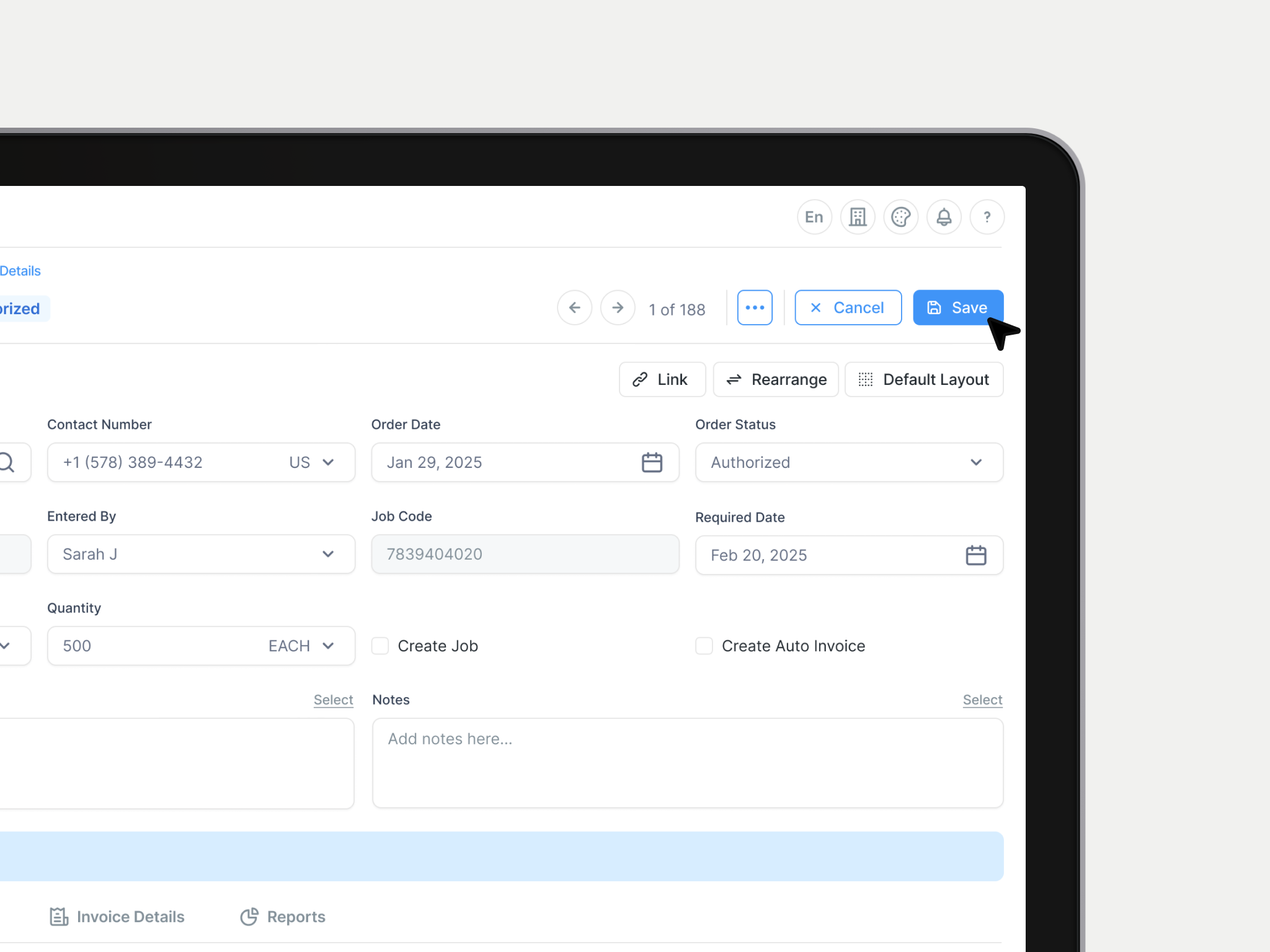
Contextual action buttons — only relevant actions appear, no more inactive gray buttons.

Clear information hierarchy — details now live in a dedicated section with a focused layout.

Dark mode & contrast mode — accessibility-first design that reduces eye strain and supports visual needs.
Impact
Post-launch, our analytics team tracked how the redesigned ERP system impacted key performance and user experience metrics across clients. The data confirmed what users were telling us: the new experience made a real difference.
Customer Satisfaction (CSAT)
+20%
Customer Retention
+12%
User Friction Reduction
-25%
But more importantly? The people who once dreaded using the system now love it. That’s the power of great UX.
Want to hear the story behind the screens?
I’d love to share how these ideas came to life.